The High Cost of the Infinite Surface
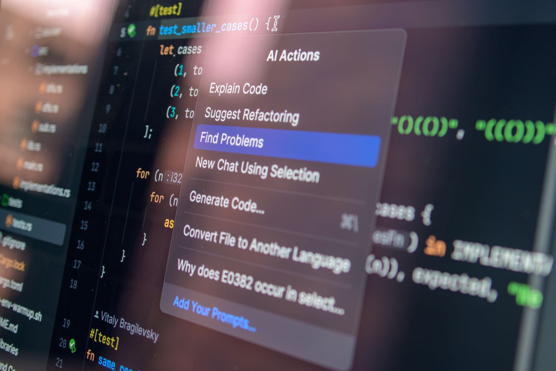
Modern infrastructure has spent the last two decades obsessed with the 'glass cockpit' philosophy. By consolidating every valve, circuit breaker, and emergency protocol into a series of nested software menus on a uniform touchscreen, we believed we were achieving peak efficiency. Instead, we created a massive cognitive bottleneck. When a technician at a high-pressure water treatment plant or a power substation is forced to navigate a flat, glowing rectangle during a crisis, they aren't just managing a machine; they are fighting a UI designer's hierarchy.
The problem is cognitive fatigue. Human spatial reasoning is built to remember where things are in three-dimensional space, not which sub-menu holds the 'emergency shutoff' toggle. In a 1965 Soviet control room, the physical distance between the cooling pump lever and the turbine bypass switch provided an immediate, visceral map of the facility. You didn't need to look at the switch to know you were touching it. The resistance of the metal, the satisfying thud of the contactor, and the specific arc of the handle provided sensory feedback that confirmed an action was taken. Today, we have replaced that certainty with a haptic buzz that feels the same whether you're opening a valve or deleting an email.
Spatial Memory and the Architecture of Crisis
There is a reason why post-digital architecture is looking back at the massive semicircular arrays of the Cold War era. Those rooms were designed around the human reach. By curving the control panels, engineers ensured that every critical gauge was equidistant from the operator’s eyes. This wasn't an aesthetic choice; it was a biological one. In these environments, the room itself becomes an extension of the operator’s nervous system. If a light flashes in the upper-left periphery, the operator knows exactly which subsystem is failing before they even read the label.
Compare this to a modern 'minimalist' command center where four identical monitors sit on a desk. Every pixel is the same distance from the eye. Every alert looks like a Windows notification. This creates a phenomenon known as 'attentional tunneling,' where the operator loses the big-picture context of the machine they are supposed to be governing. The reintroduction of physical switches—each with a unique shape, texture, and location—restores the spatial anchor that prevents human error during high-stress intervals.
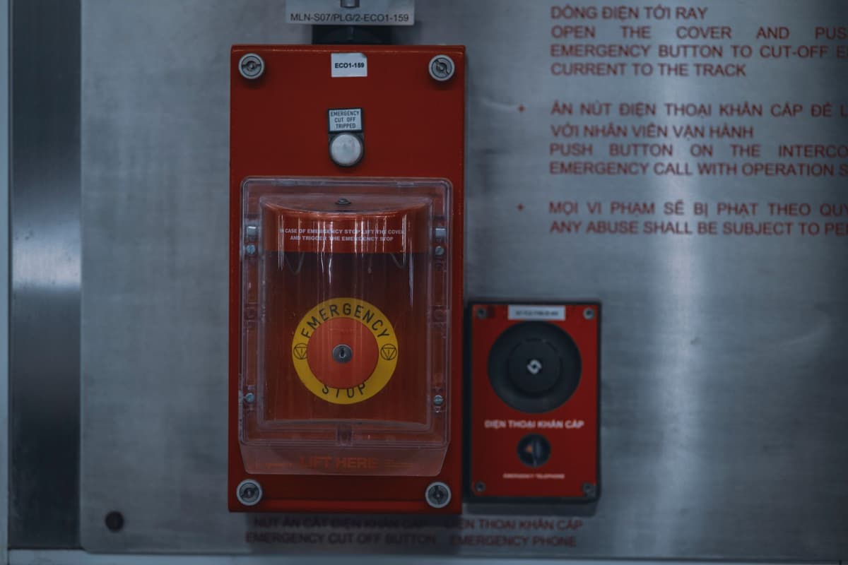
Architects in cities like Berlin and Tokyo are now experimenting with 'hybrid consoles' for transit hubs and power grids. These designs feature physical override controls embedded directly into the desks. They are admitting that the 100% digital interface was a mistake of over-optimization. We sacrificed the reliability of muscle memory for the cheapness of software updates. The cost of that trade is only now becoming clear as we see the rise in 'boredom-induced' errors in highly automated systems.
The Ergonomics of Resistance
Safety is not just about the logic of the code; it is about the physics of the interaction. A touchscreen has no 'pre-fire' state. Your finger is either touching the glass or it isn't. Conversely, a physical switch requires a specific amount of force to move. It offers resistance. This physical barrier acts as a subconscious safety check. You have to mean to move it. This tactile 'friction' is the very thing digital designers tried to eliminate, yet it is the most important safeguard we have against accidental input.
Beyond the physical act, there is the matter of reliability under duress. A software-based interface is vulnerable to lag, OS crashes, and the inherent fragility of the hardware it runs on. A hard-wired analog switch bypasses the entire stack. In a catastrophic failure where the network is down or the screens are dark, the physical architecture of the control room remains. You can still feel your way to the controls. This is the ultimate redundancy: the human hand and a piece of solid copper.
What This Actually Means
We are witnessing the end of the 'digital for digital's sake' era in critical infrastructure. The move toward post-digital architecture isn't about nostalgia or a 'retro' aesthetic; it is a clinical admission that the human brain requires physical landmarks to function at peak performance. When we build the next generation of air traffic control towers or nuclear decommissioning centers, the blueprint will look more like 1968 than 2018.
This shift represents a broader realization in urban planning: complexity must be managed through clarity, not just compression. Reducing a 500-room factory to a 13-inch tablet screen doesn't make the factory simpler; it just hides the complexity behind a layer of abstraction that humans aren't evolved to handle. We are returning to the tactile because the tactile is where the truth of the machine resides.
Ultimately, the 'vintage' Soviet aesthetic was simply the last time we designed for the human animal rather than the digital consumer. By re-adopting these principles, we aren't going backward. We are finally moving forward with a more mature understanding of how we actually interact with the world we've built.
Quick Answers
Is this just an aesthetic trend for architects?
No, it is a functional shift driven by safety data that shows touchscreens increase response times and error rates in high-stress environments.
Aren't physical switches more expensive to maintain?
Initial installation is higher, but they offer decades of reliability without the need for constant software patches or hardware cycles that plague digital systems.
Does this mean we are getting rid of screens entirely?
No. The goal is a hybrid approach where screens provide high-density data while physical controls handle the 'critical path' of operation and emergency response.